Cleverly

AI-Powered Learning Platform

ROLE

Lead UI Designer, 
UX Contributor

SKILLS

Prototyping, Interaction Design, Visual Design

PROJECT TYPE

Web-based AI-Driven Platform Design

RESULTS

High-fidelity interactive prototype

TEAM

4 UX/UI designers (Capstone project)

Background

This project was developed as a conceptual capstone project at Monash University in collaboration with the Student Academic Success (SAS) team. Cleverly sought to inspire students to actively engage with AI, not just as a tool but as a learning companion. The goal was to enhance AI literacy, equip students with the suitable AI tools, and promote ethical AI use—ultimately preparing students to confidently integrate AI into their academic and professional careers.

👀 Our design approach followed a lean and iterative UX process, prioritising usability testing and rapid prototyping.

🖥️ While this case study includes the UX process for context, the main focus is on the UI iteration process, where my contributions were most impactful.

The Problem

University students struggle to integrate AI tools
into their academic workflows.

AI is reshaping how we work and make decisions every day. While it's becoming a staple in many industries, students often find it challenging to use AI effectively in their studies. Instead of being a fully integrated learning partner, AI is frequently used in a limited way, missing out on its full potential.

Research
Insights

Why do students find it tough to embrace AI?

Due to project constraints, we conducted secondary research and affinity mapping, identifying three key barriers to effective AI-driven learning.

Challenge
Insight

Overwhelming Information

Rapid AI evolution makes it hard for students to stay updated and choose the right tools.

Limited Time for Exploration

AI tools often lack differentiation, leading to decision paralysis. Students abandon tools with complex onboarding.

Ethical & Policy Concerns

Uncertainty about university policies makes students hesitant to use AI.

Snapshots from our affinity mapping and market research process.

Target User
Analysis

Meet Emmy, a university student embarking on a new semester.

To ensure our design truly addressed student needs, we developed a user persona and storyboard—grounded in research insights and our own experiences as students. This process helped us step into Emmy’s shoes, deepening our empathy and shaping solutions that tackle real challenges.

Snapshots of persona development and storyboard. Click the image for details.

Insight

By analysing Emmy’s experience,
we identified key insights to guide our design decisions.

Pain Points

Lack of AI literacy

Finds AI concepts confusing and lacks confidence in applying them academically.

Limited time

Students have limited time and struggle to efficiently find and learn the right AI tools.

Ethical concerns

Uncertainty about AI policies makes students hesitant to use AI and unsure about their usage.

Goals & Needs

Build AI knowledge

Wants simple, structured learning to build AI knowledge without feeling overwhelmed.

Guided Selection

Needs guided recommendations to select suitable AI tools.  Prefers AI-assisted exploration to quickly understand how to use them.

24/7 Assistant

Needs an always-accessible guide to ensure responsible AI adoption.

Potential Solution

Curated learning resources and personalised AI summaries for quick, relevant insights.

An AI-powered tool recommendation system with step-by-step interactive guidance.

AI ethics assistant providing academic integrity guidance.

How might we design an intuitive AI learning system that inspire students to actively engage with AI while fostering responsible use and building strong AI literacy?

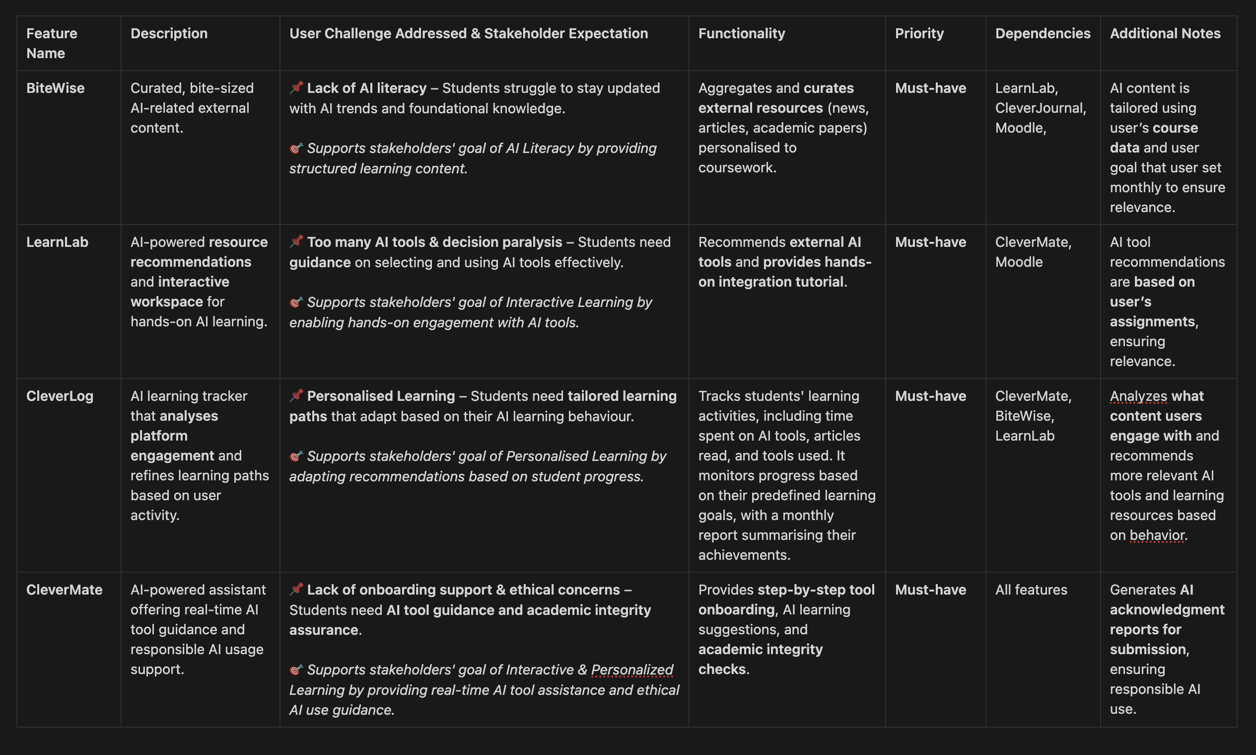
Feature Definition Table

We identified students' core challenges.
But we also needed to align with client's expectations.

Our client, the SAS team, prioritised AI literacy, interactive learning, and personalised AI adoption. To align both user and client needs, we created a feature definition table—our roadmap before moving on to the user flow. Sharing it with the team ensured alignment and clarity in our next steps.

Feature Summary

Feature Name & Description
User Challenge Addressed
Stakeholder Expectation

BiteWise

AI-driven curation of bite-sized AI-related external content.

Lack of AI literacy
Students struggle to stay updated with AI trends and foundational knowledge.

AI Literacy & Personalised Learning by providing curated learning content.

LearnLab

AI-powered resource recommendations and interactive workspace for
hands-on AI learning.

Too many AI tools & decision paralysis
Students need guidance on selecting and using AI tools time effectively.    

Interactive Learning by enabling hands-on engagement with AI tools.

CleverMate

AI-powered assistant offering real-time AI tool guidance and responsible AI usage support.

Ethical concerns
Students need AI tool guidance and academic integrity assurance.    

Interactive & Personalised Learning by providing real-time AI tool assistance and ethical AI use guidance.

CleverLog

AI learning tracker that analyses platform engagement and refines learning paths based on user activity.

Personalised Learning by adapting recommendations based on student progress.

Design Concept

With Cleverly’s core features defined, the next step was crafting a visual identity that reinforced its mission. For students to embrace AI, the design needed to instil confidence—a structured, intuitive interface that eliminates hesitation and makes AI learning feel seamless.

UI Design 1st phase

We thought we had a solid direction—until we saw it in action.

Problem

Our initial design lacked confidence and engagement, failing to align with our visual design keywords. The muted blue palette and text-heavy interface made the platform feel uninspiring for students.

Solution

·  Introduced a vibrant orange palette to create a more energetic and engaging feel.
·  Designed a dynamic layout to establish a stronger visual hierarchy.

Result

The new concept provided a clearer visual direction, enabling us to refine interactions and explore deeper design details in the next phase.

UI Design 2nd phase

The bigger the project got,
the harder it was to keep things consistent.

Problem

As the project expanded, inconsistencies in spacing, typography, and colour usage made it difficult to maintain design cohesion. Without a structured system, collaboration became inefficient.

Solution

·  Developed a comprehensive design system with standardised UI components.
·  Ensured WCAG-compliant contrast ratios for accessibility.
·  Built a Figma component library to streamline collaboration and scalability.

Result

Faster design iterations, improved team collaboration, and a cohesive user experience.

Usability Testing

We went outside, engaged with real target users,
and listened to their feedback.

To validate our design decisions, we conducted usability testing after implementing the design system.

Test Overview

Method

Task-based usability testing with a think-aloud approach.

Participants

4 students from different academic backgrounds.

Process

Users completed real-world scenarios while verbalising their thoughts, and their interactions were observed and recorded.

Task & Question examples

Scenario 1

Bookmarking a BiteWise Card

Task

Organise the BiteWise cards and bookmark the card titled “Chatbots are the Future of Customer Service.”

Questions examples

·  What did you find easy or challenging?
·  Were there any confusing steps?
·  How confident did you feel completing the task?

Usability Testing
Insight

Based on these insights, we identified how to iterate.

Issue Identified

Navigation Clarity

Low icon visibility made it difficult for users to interact with main page cards.

Content Readability

Text blocks reduced scannability and approachability.

Colour Overload

Overuse of vivid colours made it hard for users to focus on content.

Design Refinement

Increased icon contrast and size to improve visibility.

Reorganised information with clearer typography and spacing.

Adjusted colour balance to prioritise readability and reduce distractions.

UI Design 3rd phase

We were nearly there,
but the brand identity still wasn’t clear.

Problem

Despite previous refinements, the brand identity still lacked clarity and structure, making the platform feel less distinctive.

Solution

·  Introduced a structured line motif to enhance brand consistency.
·  Redesigned the layout to enhance visual clarity and improve user readability.
·  Implemented animated interactions to increase engagement.

Result

Students found the refined branding more recognizable, structured, and engaging, aligning with Cleverly’s mission.

Visual System & Branding

We refined the details to create a more cohesive experience.

To reinforce a cohesive brand presence, we developed a final visual system ensuring UI consistency across all components.

Impact

The style guide served as a centralised reference, ensuring all team members followed a consistent design approach. This minimised inconsistencies, improved collaboration, and streamlined the design process, making it easier to maintain a cohesive look across all screens.

Beyond the Project

To ensure successful adoption, I conducted a training session for team members, explaining how to apply the style guide effectively. This helped standardise future designs and maintain visual coherence across all platforms.

Final Design

Cleverly provides an AI-powered learning experience designed to help students confidently and responsibly integrate AI into their academic workflows. Guided by two key visual principles—Confidence and Approachability—the platform balances bold, structured elements with an intuitive, engaging interface to encourage AI exploration without hesitation.

How Each Feature Solves a User Need
BiteWise

Tackles information overload by delivering bite-sized AI insights, ensuring students stay updated without feeling overwhelmed.

LearnLab

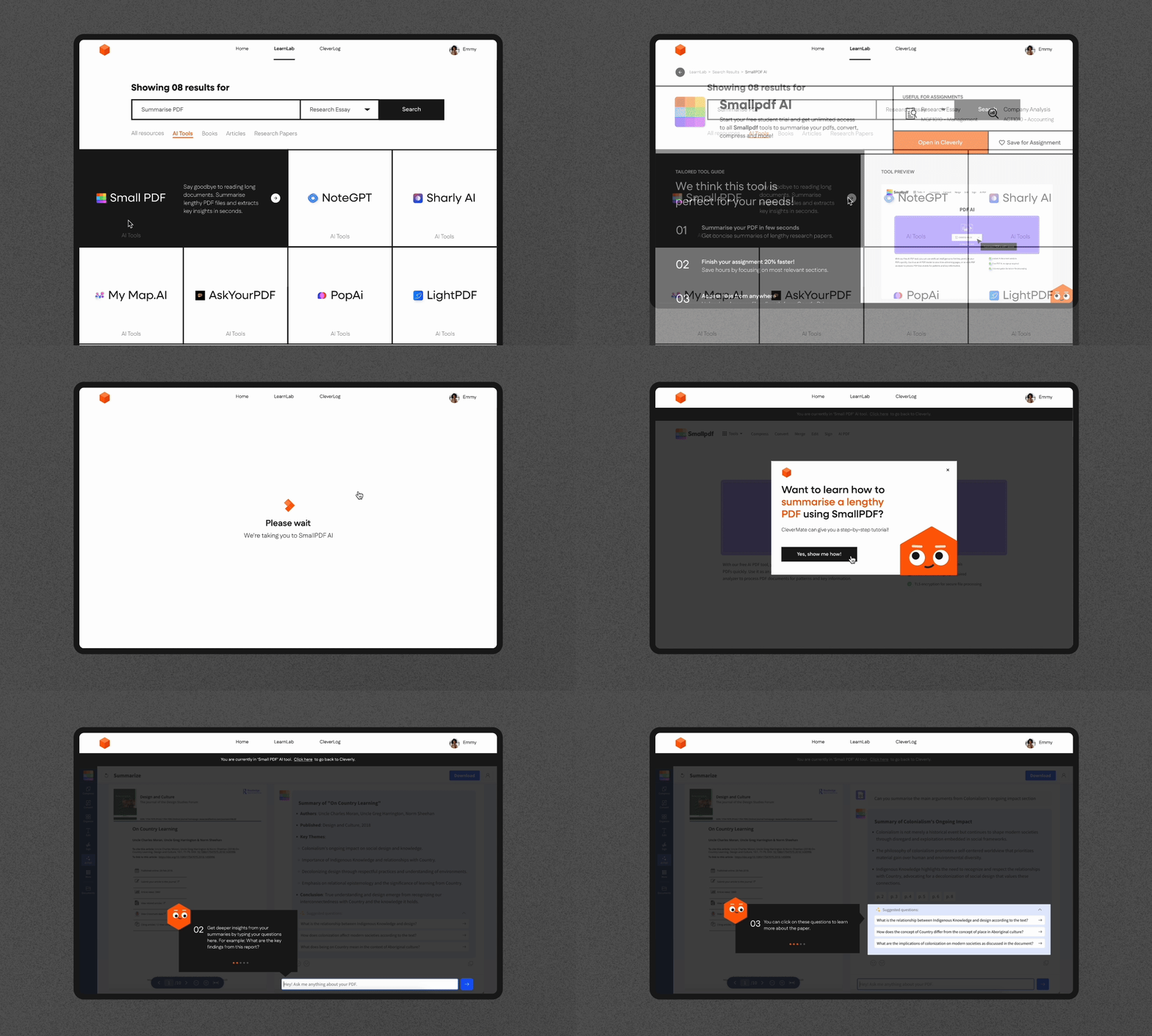
Supports hands-on learning by providing a guided workspace, allowing students to apply AI tools directly to real assignments.

CleverLog

Addresses the need for AI literacy tracking, enabling students to monitor progress, set goals, and reflect on their learning journey.

CleverMate

Provides real-time AI guidance, helping students use AI ethically and effectively while seamlessly integrating it into their studies.

Impact

🏆 Praised by Monash University faculty for its innovative approach to AI literacy.
🏆 Selected for a second showcase with the Student Academic Success team, generating strong interest from learning advisors.

Reflections

Collaboration & Communication

Design is never a solo effort. Hosting a style system workshop helped align the team, streamline decision-making, and create a shared visual language. Beyond the design team, we had several opportunities to pitch ideas to stakeholders, requiring us to craft compelling presentation decks. This was demanding, but it sharpened my ability to communicate design rationale clearly and persuasively.

Embracing Iteration

Initially, it was daunting to revisit and change core design elements, but we learned that good design requires bold iteration. Sometimes, the best decision is to step back, reassess, and refine—even if it means reworking foundational elements.

Less is More

At the start, our team wanted to showcase everything, but the result was overwhelming. This project taught me the importance of focus and clarity—prioritizing what truly matters to create a more intuitive user experience.

Bridging AI & Design

Rather than treating AI as a magic solution, we conducted in-depth research to understand its real capabilities and limitations. I explored documentaries, books, and case studies to grasp how AI-powered learning tools function and where they fall short. This informed our design approach, ensuring we leveraged AI realistically